Fiorentina’s red lily is one of Italian football’s most distinctive symbols. Yet the club has not always presented it in the same way. From the experimental F-shaped identity of the 1980s to successive diamond crests and the cleaner 2022 design, Fiorentina offers a striking study of how one symbol can support several different logos.
Fiorentina logo timeline
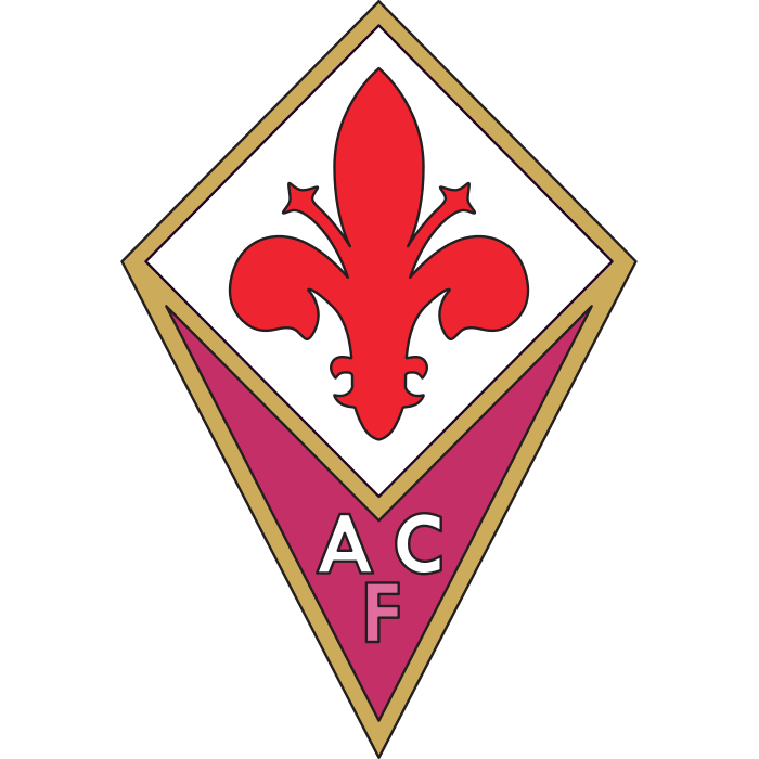
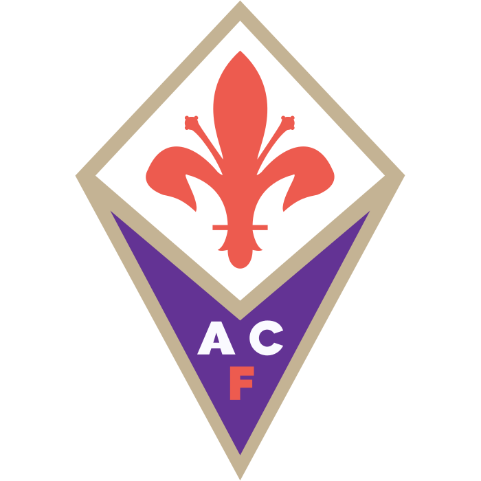
Compare the shapes, lettering and symbols in these selected versions. This is a timeline of designs used during the period, rather than every colour or anniversary variation.


Logo images: football-logos.cc. Club emblems belong to their respective owners and are shown for historical comparison.
The 1980s experiment
The circular badge associated with the 1980s combined a stylised F with the red lily. It stands apart from the diamond-shaped designs that followed. This illustrated history of Fiorentina’s logos shows the transition between those forms.
The F makes the club’s initial part of the picture rather than a separate line of text. That is a bold approach: the viewer must read the letter and the flower as one arrangement. Compared with a conventional shield, the result feels more like a graphic symbol built around a single idea.
The diamond returns
The 1991-era design placed the lily above the initials ACF inside a diamond. The longer-lived version used from 2003 kept the same broad structure while changing its finish and proportions. Purple, white, red and a gold outline created a clear hierarchy between the flower and the lettering.
Compare these versions with the Fiorentina badge in our collection. The frame is doing real work: its pointed shape separates the upper emblem from the lower initials and gives the crest a recognisable outline even when individual details are small.
The cleaner identity introduced in 2022
The new design was presented in March 2022 and came into use that July. It retained the red lily and a diamond structure, while removing the familiar gold edging and reducing the amount of lettering. The timing and design are documented in coverage of its introduction.
The new version asks the lily and outline to carry more of the identity. With fewer separate details, the eye moves quickly to the red symbol. At larger sizes, however, the older gold-edged badge offers a different sense of richness and decoration.
What stayed constant?
The lily is the strongest thread through this timeline. It connects the club to Florence even when initials, borders and proportions change. That makes Fiorentina a useful example of redesigning around an existing symbol instead of inventing a completely new one.
Try comparing each badge at both large and small sizes. The 1980s letterform, the detailed diamond and the latest outline each distribute attention differently. A design that looks elegant in a large illustration may need stronger contrast on a small match graphic.
Explore other Italian club emblems in our football badge collection and follow more changes on the badge history page. For practical advice on displaying a crest clearly, read our guide to PNG and SVG football badges.