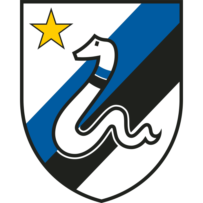
Inter’s badge is famous for intertwined letters, but the club did not spend the entire modern era wearing a circular monogram. During the 1980s, a snake on a shield offered a very different expression of the Nerazzurri identity. The journey back to initials makes Inter an especially revealing example of how clubs balance recognition with reinvention.
Inter logo timeline
Compare the shapes, lettering and symbols in these selected versions. This is a timeline of designs used during the period, rather than every colour or anniversary variation.

Logo images: football-logos.cc. Club emblems belong to their respective owners and are shown for historical comparison.
The snake steps forward
The snake shield introduced in 1979 moved away from the densely interwoven letters associated with Inter’s earliest identity. The animal gave the crest a strong silhouette, while the blue-and-black field connected it to the team’s colours. Inter’s official crest history documents the snake era and its late-1980s variations.
Placed beside a monogram, the shield feels more like a sporting emblem than a signature. You can understand its basic subject immediately, even before reading the name. That is the advantage of an animal symbol: it can carry a club’s personality without requiring a viewer to decipher several overlapping letters.
The monogram returns
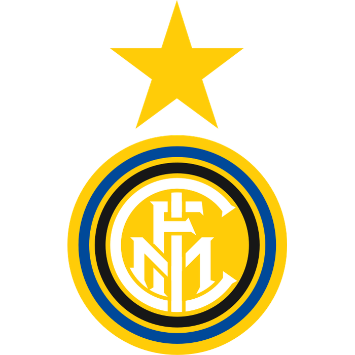
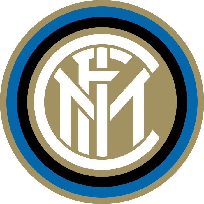
In 1989, the circular FCIM design returned. Later versions adjusted its rings, lettering and proportions, including the refinement introduced in 2014. The central idea remained recognisable: initials held inside blue, black and gold circles. These are different versions of a shared visual language, rather than four unrelated identities.
Compare the historical examples with our Inter badge page. Pay attention to the space between the letter strokes. Small changes can make a complicated monogram feel either crowded or balanced, especially when the badge is reduced to the size of a score graphic.
Why the 2021 badge uses IM
The 2021 redesign placed the letters I and M at its centre. Inter described it as a modern expression rooted in Giorgio Muggiani’s original design, retaining the circular structure and blue-and-black identity. The club’s new-logo announcement explains that connection.
The result reads more quickly at small sizes. Fewer competing strokes give the two initials room to become a single symbol. The trade-off is equally visible: the older monogram rewarded close inspection, while the new mark favours immediate recognition.
What Inter’s evolution teaches us
A club can change the structure of its badge while keeping its colours and core identity intact. Inter’s sequence shows three approaches: an animal-led shield, an intricate circular monogram and a simplified initials-based mark. Each solves a different design problem.
Explore more Italian teams in our football badge collection or use the badge history page to compare other redesigns. For a useful contrast, Juventus’s move to the J shows how far a club can reduce a traditional crest while trying to preserve a recognisable idea.