Juventus made one of football’s most noticeable identity changes when a compact J replaced the traditional oval. But the story did not begin in 2017. Comparing late-1980s and 2004 crests with the two modern J treatments shows how the same club can express its identity through very different structures.
Juventus logo timeline
Compare the shapes, lettering and symbols in these selected versions. This is a timeline of designs used during the period, rather than every colour or anniversary variation.



Logo images: football-logos.cc. Club emblems belong to their respective owners and are shown for historical comparison.
The late-1980s oval: a layered emblem
The pictured 1989–2004 crest combines an oval outline, black-and-white stripes, a name panel and a smaller heraldic element. The historical logo timeline identifies this period and the later 2004 version.
Several layers contribute to recognition. The outer shape provides a familiar container, the stripes link the image to the club’s visual identity, and the smaller components reward closer viewing. It is a design that works at more than one level of detail.
2004: retaining the oval while changing the drawing
The 2004 crest keeps the oval concept but redraws its lettering, spacing and internal elements. That makes it a useful example of a redesign that preserves its basic architecture.
Look at how much room sits around the name and how the stripes meet the central panel. Those relationships are easier to understand with both versions shown at the same size. A change can be substantial without discarding the outline that supporters know.
2017: a J with several references
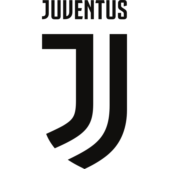
Juventus adopted its new identity in July 2017. The club explained the design through the J, the black-and-white stripes and the suggestion of a Scudetto. The official launch announcement identifies those references.
The new mark removed the oval container. Recognition now depended on a smaller set of forms and on their repeated use across club materials. That shift is more than a tidy update to an existing drawing.
2020: the standalone symbol
In its own explanation of the modern identity, Juventus records the removal of the word Juventus above the mark in 2020. The official logo page describes that second step.
This produces two modern versions worth distinguishing in captions: the J with the name above it and the standalone J. They share a core shape, but ask different things of the viewer.
What changes and what remains?
Across the selected designs, the black-and-white identity provides continuity. The larger change concerns how many elements are needed to communicate the club. A detailed crest and a compact mark can each be recognisable, but they do so through different visual relationships.
Compare the images at a small size, then enlarge them. Which elements remain clear? Which details need space? That is a more useful starting point than assuming that complexity or minimalism automatically wins.
Explore the Juventus identity
Open our Juventus badge page, browse the badge archive, and use our PNG and SVG guide when displaying the designs. The football badge library offers more examples of compact and detailed marks.