Manchester City’s badge history offers a clear contrast between three different structures: a round rose emblem, an eagle behind a shield, and a later return to a circular design. The club’s colours connect the versions, but the outlines change enough to make each era visually distinct.
Manchester City logo timeline
Compare the shapes, lettering and symbols in these selected versions. This is a timeline of designs used during the period, rather than every colour or anniversary variation.


Logo images: football-logos.cc. Club emblems belong to their respective owners and are shown for historical comparison.
The round badge of the 1980s and 1990s
City’s historical consultation material identifies the rose design as a version worn again from 1981 to 1997. It connects the red rose with Lancashire. The club’s badge history sets out the sequence.
The round frame gives the club’s name a place around the image. Within it, a smaller shield organises the symbols. This is a useful design comparison: the outside shape remains simple while the interior carries the local references.
1997: the eagle changes the silhouette
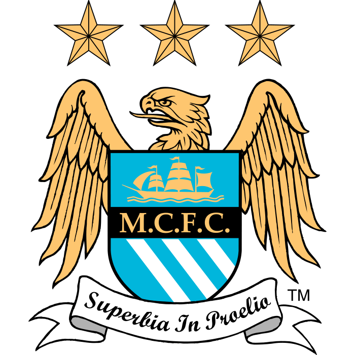
The 1997 badge introduced an eagle, a different shield outline and three stars. City’s own historical explanation describes those stars as stylistic, rather than a tally of trophies. That detail appears in the club’s consultation archive.
Place the eagle next to the earlier circle and the difference is immediate. The wings widen the mark; the shield becomes one element within a larger composition. A supporter can distinguish the era without needing to read the small lettering.
2016: a modern round badge with local references
City’s new badge officially launched in 2016 after supporter consultation. The club identified the ship, three rivers and red rose among its symbols, with 1894 added to recognise the club’s foundation under the Manchester City name. Read the official launch announcement.
The modern circle is not simply the old rose badge pasted onto a new shirt. Its typography, spacing and treatment of the central symbols deserve their own comparison. Returning to a shape can still involve a substantial redesign.
What the three designs reveal
These crests show how recognition can depend on different things in different periods. The eagle offers an expansive silhouette; the circular designs rely more on the relationship between their outer ring and central shield.
Rather than ranking them immediately, ask which details remain legible at a small size and which are most connected to place. Those questions make the differences easier to explain.
Explore City in the library
Open our Manchester City badge page, connect the club to its location in the football atlas, and compare other examples in the badge library. The history archive is the starting point for further crest comparisons.