PSG’s crest history contains a striking interruption: for a period in the 1990s, large letters took the place of the familiar Eiffel Tower. Before and after that experiment, the tower remained central, but the surrounding elements changed. The result is a useful study of how a football identity can move between a landmark and a word-based mark.
PSG logo timeline
Compare the shapes, lettering and symbols in these selected versions. This is a timeline of designs used during the period, rather than every colour or anniversary variation.
Logo images: C.F. Classics. Club emblems belong to their respective owners and are shown for historical comparison.
The 1980s: putting the stadium beneath the crest
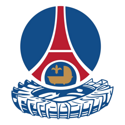
The pictured 1982-era version adds a representation of the Parc des Princes beneath the round Eiffel Tower emblem. It makes the mark taller and brings the ground itself into the composition. The illustrated PSG crest archive dates this version.
As a design choice, a stadium introduces a very different shape from the tower. It also asks the badge to carry both a city landmark and a place specifically associated with watching the team.
1992–96: the letters become the identity
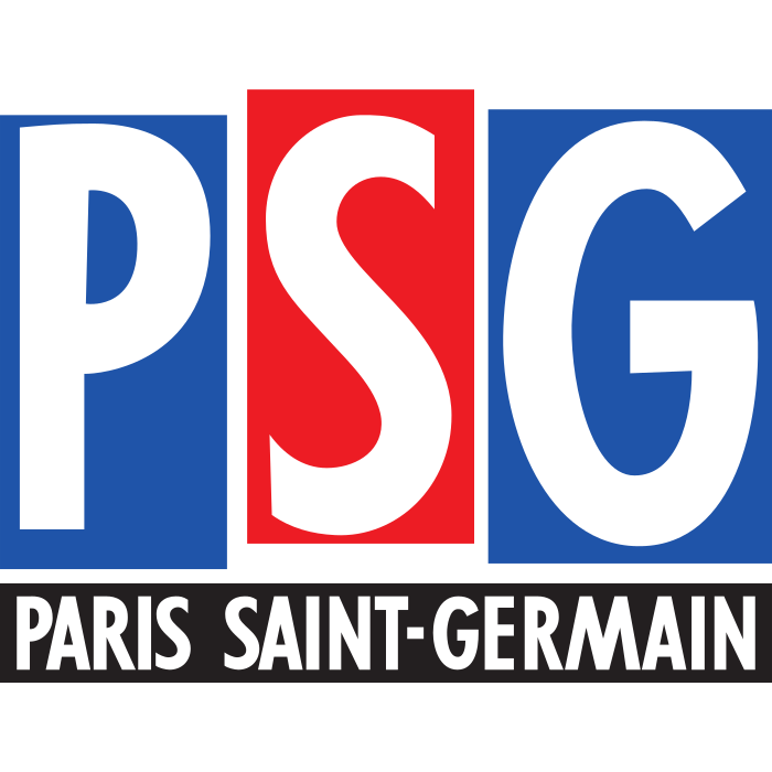
The 1992 design replaces the tower-led arrangement with large P-S-G lettering. It is the sharpest visual break in the selected sequence. The same archive illustrates the lettering era.
The comparison is interesting even without ranking either approach. One design identifies the club through an image; the other puts its abbreviated name first. A strong word-based mark depends heavily on the proportions and arrangement of its letters.
1996: a return to the tower
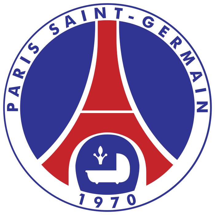
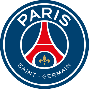
The 1996 version restored the Eiffel Tower composition with an outer name ring and the founding year. The illustrated 2013 redesign later gave PARIS greater emphasis and removed the cradle and foundation year from that arrangement. The archive shows the two designs side by side.
Returning to an older symbol does not mean freezing every detail. Letter size, spacing, outlines and colour can change the balance while leaving the central landmark recognisable.
How to read the differences
Begin by comparing the silhouettes. The stadium extension creates an additional lower shape; the lettering mark creates a broad word-based profile; the circular tower crests depend on their outer ring.
Then look at emphasis. Which part can you read first at a small size? Which details disappear when the image is reduced? Those observations provide a clearer explanation than simply calling one crest traditional and another modern.
Explore PSG’s badge and its surroundings
Visit our Paris Saint-Germain badge page for the library image. Locate the club through the football atlas, compare other designs in the badge library, and continue to the badge archive for more crest comparisons.