Chelsea’s lion is a familiar sight, but the way it has been drawn has changed dramatically. A heraldic figure, a lion above CFC lettering and a later circular crest all belong to the club’s visual story. Looking across those versions reveals how a team can change its presentation while keeping an animal at the centre of its identity.
Chelsea logo timeline
Compare the shapes, lettering and symbols in these selected versions. This is a timeline of designs used during the period, rather than every colour or anniversary variation.

Logo images: football-logos.cc. Club emblems belong to their respective owners and are shown for historical comparison.
The crest worn in the early 1980s
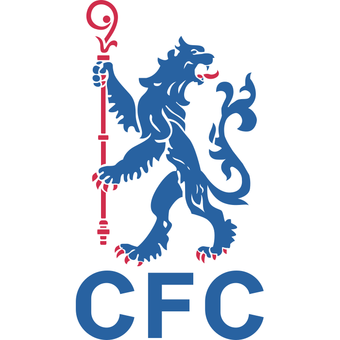
The early-1980s example pairs a heraldic lion holding a staff with CFC lettering. Chelsea’s own history connects its lion badge partly to the coat of arms of the Metropolitan Borough of Chelsea. The club explains that historical connection.
Look at the silhouette before the details. The staff and pose make this a deliberately arranged emblem rather than a naturalistic animal drawing. The staff-bearing lion gives supporters a recognisable anchor even when surrounding elements vary.
1986: a different lion and the CFC initials
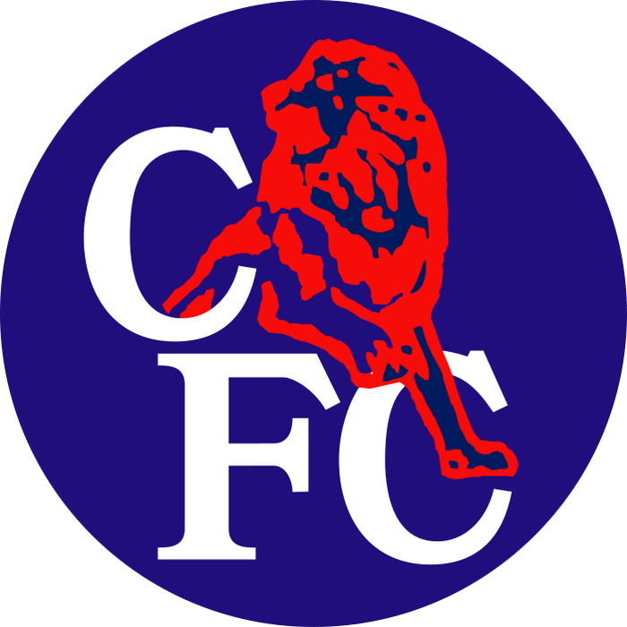
Chelsea adopted a new badge in 1986, retaining the lion but combining it with CFC lettering. The club’s archive records subsequent colour variations and its use until 2005. Read Chelsea’s account of the redesign.
The visual change is larger than a simple palette update. The relationship between the animal and letters changes the reading order: a viewer notices the large initials and the animal inside a more compact arrangement.
2005: returning to a heraldic structure
The circular crest introduced for 2005/06 restored an approach associated with the earlier lion identity. Chelsea’s historical anniversary notes place that return in the 2005/06 season. The club’s retrospective confirms the timing.
Compare the modern circular image with the early-1980s version. The family resemblance matters, but the proportions, lettering and supporting details should still be examined as parts of a separate design.
Full crests and shirt treatments are different things
A shirt can use an animal on its own without making every other version obsolete. Chelsea’s 2026/27 kit coverage describes a prominent lion treatment alongside the roundel woven into the fabric. The official kit gallery shows the distinction.
That context is important when dating a photograph. A season-specific application should not automatically be labelled a complete replacement of the club’s crest.
Explore the Chelsea identity
Visit our Chelsea badge page to examine the library image, or continue through the football badge history archive. Our article on why badges matter explores why supporters connect so strongly with these small changes.