Tottenham’s cockerel provides continuity through a history of changing frames and lettering. At different times it has shared space with a monogram and decorative elements, sat within a more formal crest, or stood as a compact symbol above a football.
Tottenham logo timeline
Compare the shapes, lettering and symbols in these selected versions. This is a timeline of designs used during the period, rather than every colour or anniversary variation.
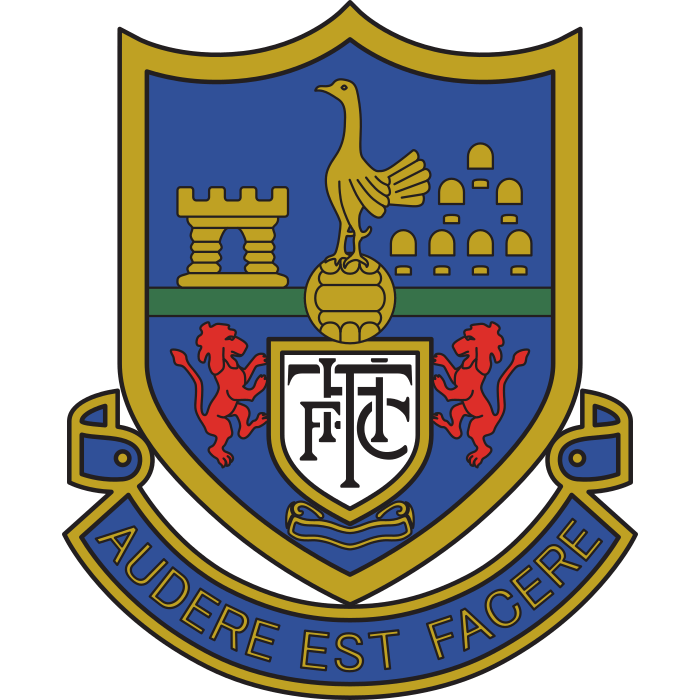
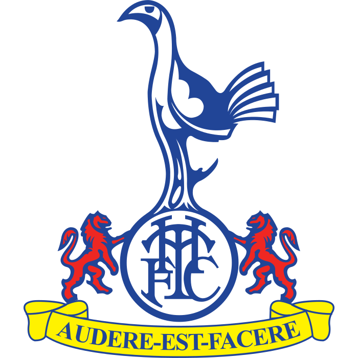


Logo images: football-logos.cc. Club emblems belong to their respective owners and are shown for historical comparison.
The 1980s badge: several elements working together
Tottenham’s official historical explanation dates the badge combining two lions, a cockerel and a ball to 1983, with an update in 1992. It also distinguishes that badge from the club’s older formal shield. The club explains the separate traditions.
That distinction helps avoid a common mistake: treating every historical image as the only mark used throughout an era. Shirts, documents and other club materials can use different approved treatments at the same time.
The detailed crest around the turn of the century
The illustrated 1999–2006 version gives more space to a formal crest arrangement. Compare it with the 1983 example and notice how the cockerel is framed, how the initials are positioned, and which decorative elements shape the outline.
Tottenham’s illustrated educational crest history is a useful reference for the variety of historical applications. A caption should identify the pictured version rather than assume all kit and corporate uses followed one exact timeline.
2006: putting the cockerel and ball first
When Tottenham introduced its 2006 identity, the club placed the cockerel and ball at the centre and included the Tottenham Hotspur name. The original announcement describes the design.
The result asks a smaller set of components to carry the recognition. Removing surrounding detail makes the outline more exposed: the curve of the bird and the shape of the ball have to work together without a large container.
2024: refining the identity system
Tottenham announced a remastered brand in November 2024. Its explanation included a silhouette treatment, a revived THFC monogram and heritage references within the broader system. The club’s announcement shows how the identity expanded.
A brand system contains more than a single badge. Comparing its different marks can be more revealing than looking for one replacement image and ignoring everything around it.
Compare the designs yourself
Visit the Tottenham badge page and our football badge library. For practical advice about displaying crests at different sizes, read the PNG and SVG guide. Continue into the badge archive for more historical comparisons.