Aston Villa’s lion has lived inside both circular and shield-shaped badges. Looking across the modern versions reveals a club repeatedly adjusting the frame around a recognisable symbol. The most recent changes also show why a crest’s shape can become almost as important to supporters as the animal at its centre.
Aston Villa logo timeline
Compare the shapes, lettering and symbols in these selected versions. This is a timeline of designs used during the period, rather than every colour or anniversary variation.

Logo images: football-logos.cc. Club emblems belong to their respective owners and are shown for historical comparison.
The shield of the 1990s
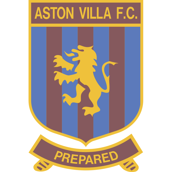
The 1992-era shield combined a lion with the Aston Villa name and a strongly divided layout. Later shield versions changed the lettering, colours and surrounding details. A historical gallery of Villa crests provides a useful visual record of this sequence.
A shield creates a clear boundary around the artwork. It can hold words, dates and symbols in separate areas without making them feel disconnected. The challenge is avoiding a crowded result: a lion needs enough room to look like an animal rather than a collection of tiny strokes.
A lighter background and the European star
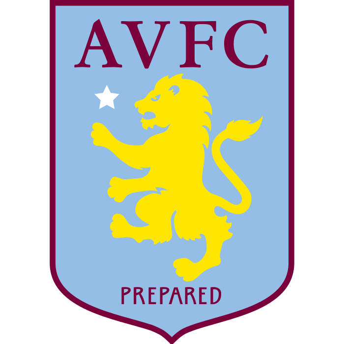
The pale-blue shield used in the late 2000s and 2010s changed the visual balance. The lion and initials became the main points of attention, with a star recalling Villa’s 1982 European Cup victory. The Premier League’s explanation of club badges also connects the lion to Scottish heraldry and founder William McGregor.
That background gives the crest a different mood from the earlier divided shield. Even when the animal remains familiar, changing the dominant colour can make the whole badge seem newer. Compare these examples with our Aston Villa badge page.
The round badge of 2023
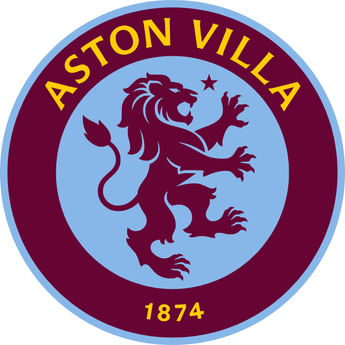
The circular design used in 2023–24 reorganised the identity around a round frame. The full club name, lion and star formed a composition that contrasted sharply with the preceding shield. It was a visible change in silhouette, not simply a tweak to the same outline.
Circles suit a centred animal and surrounding lettering. They also make useful profile icons. But the frame inevitably changes how the lion occupies the space: its direction, size and relationship to the words become more noticeable when there are fewer corners and compartments.
Back to a shield in 2024
Villa’s 2024 identity returned to a shield, with the club name, lion, star and founding year arranged inside it. The Premier League’s account identifies this as the badge following the brief circular version.
Seeing the round and shield designs together is more helpful than judging either in isolation. The circle emphasises a compact emblem; the shield offers a structured home for several pieces of club history. Neither shape guarantees a successful design on its own.
Follow the lion through the changes
Villa’s sequence is a lesson in continuity through revision. Start with the lion, then examine the frame, lettering and colour proportions. That order makes it easier to identify what has actually changed.
Discover other Midlands clubs through our football badge map and compare more redesigns in the history section. You can also browse the complete badge collection to see how other teams use lions, stars and shields.